Bringing the Tour de France to life with graph and timeline visualization
Data visualization expert and cycling enthusiast, Julia Robson, explores the history and dynamics of the legendary Tour de France with unique visuals
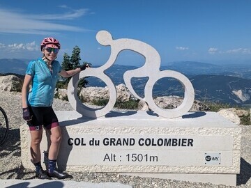
Julia Robson, a software developer at Cambridge Intelligence, is riding the Tour de France route with Le Loop - one week ahead of the pros.
But before she started, she couldn’t resist using her data visualization expertise to visually explore Le Tour's history, legends, nationalities and exciting 2022 finale.
Pogacar vs. Vingegaard: Using data visualization to see how the 2022 Tour was won
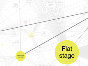
22 teams of eight riders set off from Copenhagen on July 1st 2022. Julia created a dynamic network graph and timeline visualization to explore the race from start to finish. The whole story of the GC battle unfolds as the user interacts with the time bar and tracks the changes in the graphic representation of the teams involved. It was a fantastic battle ending in victory for Jumbo-Visma’s Jonas Vingegaard, who ultimately beat Slovenian UAE Team Emirates rider and 2020 champion, Tadej Pogačar.
Julia's visualization uses shirt-shaped nodes in club colors, with an animated progress bar for each rider. As the user interacts with the time bar, changes in the visualization highlight key points in the story. A colored marker follows the yellow jersey from Vingegaard to his Jumbo-Visma teammate Wout Van Aert - early on before Pogačar won it from him. Vingegaard took it over from stage 11 and never relinquished it. Rider icons gray out as they leave the race - both teams are down to five riders by the end, but color coding and other icon customizations show that Jumbo-Visma claimed GC, points race, and king of the mountains victories.
What if we look at all of the data from all previous tours?
With this huge dataset, Julia created a larger visualization representing all the teams and riders across the entire history of the Tour de France since 1903. A network of customized nodes represents teams and riders, sized according to how many years they’ve competed in the race, joined by links labeled with their year of participation and final GC ranking.
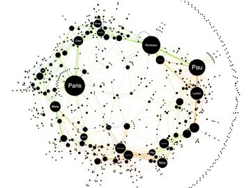
She also used our data visualization toolkits to chart the hundreds of different Tour de France stage start and finish locations; the riders’ nationalities; and stage wins according to stage types. The largest node on the final visualization is British rider Mark Cavendish, who unfortunately crashed out of the 2023 tour, in a pursuit to become the rider with the most stage wins of all times. He stays tied with two other riders with 34 wins.
The data visualization tools Julia works on at Cambridge Intelligence are used by analysts around the globe, with use cases including law enforcement, cyber security and fraud detection. They reveal patterns and hidden insights in any connected dataset, and in this example, that means cyclists, routes, trophies and colored jerseys…
Follow the full story, and see more detailed visualizations, in Julia’s blog post: https://cambridge-intelligence.com/visualizing-the-tour-de-france/
Press release distributed by Pressat on behalf of Cambridge Intelligence, on Wednesday 12 July, 2023. For more information subscribe and follow https://pressat.co.uk/
Data Visualization Tour De France Cycling Graph Visualization Network Visualization Software Timeline Visualization Interactive Graphics Computing & Telecoms Opinion Article Sport
Published By

+44 (0)1223 362000
catherine@cambridge-intelligence.com
https://cambridge-intelligence.com/
Rosy Hunt
rosy.hunt@cambridge-intelligence.com
Visit Newsroom
You just read:
Bringing the Tour de France to life with graph and timeline visualization
News from this source:


